Blog
Start making smarter, data-backed decisions with AlayaCare’s Data Exploration tool

Business intelligence remains an integral part of a home care agency to gain valuable insights into your daily operations. Whether you’re a business executive, scheduler, administrator, or caregiver, leveraging data exploration in your home care software allows you to make smarter decisions that are backed by analytics and most importantly, to achieve better outcomes.
That’s why we’re excited to announce a whole new reporting experience for AlayaCare Cloud users! Our brand-new Data Exploration tool will allow you to report on virtually any data stored with AlayaCare faster and gives you the flexibility to create the reports you need when you need them.
Check out some of the key features below:
Performance-driven reporting interface with real-time data access
There’s nothing more frustrating than waiting for your screen to load. That’s why our advance report builder is built directly in the AlayaCare platform making your reporting experience seamless and fast. Everything lives on a single reporting view, which makes it easy to navigate and build reports, no matter what your skill level is. The platform also uses a modern tech stack that manages data refreshes and version control to the background, so you’ll no longer have to wait around for updates.
How
When you open your AlayaCare Cloud platform, simply go to the data exploration tab to start building reports. You can start building a report by selecting from the list of explores. Explores are buckets of your data that are organized by type including clients, employees, services, visits, and more. Once you select the Explore you would like to use, you can easily choose the fields of data you want to use and move ahead with your reporting!
Benefits
- Eliminate downtime and planning with 24/7 access
- Stay up to date with accurate metrics with only a 2-hour data latency
- Empower all members of your home care organization with a platform that is straightforward and intuitive.
Visualizations
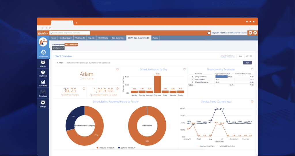
Data analytics can be complex, even for the most experienced user. That’s why it’s necessary to have a useful visualization feature to not only understand your data but to turn them into actionable insights for your team. AlayaCare’s Data Exploration tool offers a configurable visualization tab that lets you adjust the visuals for your reports in real-time. Whether you’re a scheduler looking to create a client location report or an administrator determining the visit revenue for this month, you’ll be able to configure the visuals to meet the needs of your job.
How
You can select and configure the right visualization while you’re managing your reports. Simply run to populate your data and open up the visualization tab to select the visual that best fits your needs.
Benefits
- Configure visualizations that best meet your unique needs
- Make your data easy to understand and share
- Easily detect changes or irregularities in your data trends
Calculations and filtering
When you have a pot of raw data, being able to calculate and filter the information to match your desired output is crucial to understanding the picture on a macro and micro level. Especially when you want to understand changes for a specific period of time, manipulating your data can provide you with a more accurate snapshot of the metrics you’re looking for. The new data exploration tool provides the flexibility you need to calculate, filter, pivot, and manipulate your data for the desired output. If you’re not the most comfortable with calculation formulas, the calculator feature has built-in logic-based suggestions, in addition to a hyperlinked Help & Syntax document that can provide you with further guidance.
How
Users can click the calculation button to edit a table’s calculations directly in the reporting screen. To filter out specific information in a data field, simply select filter from the gear icon, and adjust the variables of your data on the filter tab.
Benefits
- Limit the amount of data you wish to see
- Create more granular and specific reports
- Calculate new metrics and data fields on the go
- Pivot the data in your table
Configurable dashboards
Finally, dashboards allow you to bring your most important metrics to the forefront and keep track of what’s most important for you. Regardless of your user type, the new dashboard feature makes it easier to organize saved reports, filter through various analytics, and support decision-making to achieve better outcomes. They’ll provide you with a one-stop shop for all of your key metrics and can be configured in a way that works best for you.
How
When you are finished building a report, you can save it to a new or existing dashboard. When managing the dashboard of your choice, you can adjust the settings and configure everything you from the actual reports (data), text, visuals, filters, and sizes. When you’re ready to share it with your team, you can select the gear icon and download it as a PDF or CSV file easily and efficiently.
Benefits
- Keep track of all your important analytics in an organized, single view
- Adapt visuals and tile sizes to fit your needs
- Easily export dashboards to download and share with your team
AlayaCare’s new Data Exploration experience provides you all the tools you need to make more informed business and care decisions. Get in touch today and see why hundreds of customers use AlayaCare to track and measure their business operations and care delivery.


